Tuesday, October 20, 2009

Music Festival Postcard

The purpose of this assignment is to see the combination of colors. But first thing have to deal with is the content of the postcard.

At first I think about a concert with several kinds of musical instruments such as piano, guitar...I want to create a stream made of musical notes and the instruments will float on it, like the sketching below:
But I realize that it is extremely hard to create a stream like what I imagine. In addition, the appearance of so many musical notes makes the postcard very tangled. Hence, I tried the other idea.


For this idea, I just focus on piano performance. The musical note streams out the piano and become the chain of melody.

I sketch it on Illustrator:


My classmates comment that it's cute but the letter is not really standing out, I should do something to make it different from the musical notes. Hence, I change the font and add some the stars on it.


About the colors, I color 9 versions of the postcard by using Image adjustment of Photoshop:


The first three versions and the one at center are colored with the white background
The last three are with the background
I also try the two rest with gardient color.

I choose the one with NUS's color as my final design. It is simple, well contrasting and very suitable with NUS's logo. It creates a sense of identity.


Active Aging Poster


The requirement of this assignment is to design a poster that encourages the elderly in living more actively and healthily. The reality in current society is that elderly people have tendency to feel depressed due to their old and their weakness. This makes them isolate from society and think negatively, which will gradually make serious harms to their mental as well as their physical health. Therefore, it is essential to cheer them up and make them realize that they are still extremely valuable to the whole society. Even though they can not create tangible asset for society, their wises and their experiences are essential for the development of society.

I get the idea from my grandparents hobby: gardening . Whenever I observe them cultivating a tree or a flower, I often figure that they are cultivating the younger generation with what they have collected a whole life. Hence, I create "life" as a flower garden that are brought up and trimmed by the elderly people. The color for the background is blue and white coming between each other. This make the poster bright, lively and fresh.

At first, I make the poster like a jigsaw game like the picture below:


but it seems sad, not so clear, inharmonious and not eye-catching. I asked around and it's true that people does not really like jigsaw thing. Hence, I choose the more simple way but clearer:


Tuesday, September 22, 2009

You see what I see?

THE LETTER

The context of my story is in family. This is one of common conflicts that regular happen in family's daily life. Although they may mess family's a bit, through that, people can learn more how to improve themselves better to remain the happiness of their family.

When brainstorming for the content, I prefer the story with a little bit complex or conflict, then following a solution. Then I intend to create a situation in which there will be a misunderstanding that leads to a quarrel, and finally the explanation will come out to get rid of all suspicions. In this story, I choose the love letter, which supposes to bring happiness to the person receives it, as the factor that causes all troubles.

Now look at all the photos. Can you realize the content? If not, read the interpretation at the end.


Picture 1: The girl receive the letter from her boyfriend
Picture 2: She is at living room and reading the letter with extremely happiness.
Picture 3: After reading, she puts the letter into the magazine on the table, while her parents are coming in.
Picture 4: Her parents sit down and read newspaper. Her father unintentionally takes the magazine in which the girl puts the letter.
Picture 5: His father finds out the letter and he wonders that if his wife is untruthful.
Picture 6: He and her wife are quarreling seriously about the problem, when the girl comes in.
Picture 7: The girl explains the problem and tries to clear all his suspicions on her mother.
Picture 8: The girl and his father apologize the mother.

Friday, September 11, 2009

Abstraction

The requirement of this assignment is that choosing a place in Singapore then creating a representative image for it. The first place I thought about is The Henderson Wave. This bridge leaves a deep impression on me not only because of its wonderful structure, but also of memories about my first Chinese New Year (in Vietnamese, it is called "Tet") in Singapore. Last year, I and my Vietnamese friends at NUS held a small gathering at this bridge to celebrate The Lunar New Year, the first Tet without our families beside. We shared special Tet's dishes, played some outdoor games and enjoyed watching firework together at there. We really had so much fun, even though Tet here was not as good and warm as our home. Here below is 6 steps of my work to create representative image for the bridge:

First of all, I chose a picture of Henderson Wave I had took last year. Then I drew the bridge it own and cleared all unnecessary parts. One classmate commented that I drew it better than it was in real photos and that encouraged me a lot :).

After that I tried to simplify it by reducing several strokes on the bridge and on the pillars as you can see at the step 3 and 4.

At the step 5, I just kept the basic shape of the bridge and at the final step, I drew the waves of Henderson Bridge, which is the most impressive thing of its structure.

The final image I select is the fourth one.

Friday, September 4, 2009

Me, myself and I

Hi,

These above are my designs for the first assignment of NM2208. This is the first time I do something related to design, decoration and coloring so that it is inevitable to have many disadvantages. Hope that you my friends, through this blog, will give me valuable advices as well as suggestions to improve my works in latter times.

About my designs, the topic is about my name and what I like or dislike. During the lecture, I sketched some brainstorming drafts in which I tried to make up my name by things I like and things I do not. You can see through the photos below:


Initially, I just thought about putting things together to build up my name, but my tutor commented that it seemed quite simple and a little bit boring. Therefore, I concentrated on observing more my classmates' designs through their presentations in class and I realized that it would be better if I built a background and arranged my stuffs in more natural order. Then, I began to sketch my background.

I mainly spent thoughts on two ideas about Christmas-the celebration I like most, and daisy-my favorite flower. I thought about bringing my Christmas stuffs, including a pine tree (represented for the letter A), a line of colorful decorative lights (the letter N) and two Christmas socks (the letter H) in a room with some gift boxes. At first, it looked like this:

I spent more than 20 hours to draw this one, because I had not familiar with all Illustrator's and Photoshop's tools. The hardest part of this picture is the pine tree, I had to look through a lot photos, draw and fixed it several times to make it looked as much as like the real one. Although I made many attempts on this picture, no one could realize that is my name, ANH. My classmates commented that the letter H (supposed to be the socks) could not be found and the gifts under the pine tree made the letter A not clear. They suggested me to move the gifts out of the tree and also move the socks higher to the lights after lengthening them. These advices were extremely helpful, my picture was improved a lot and the letters become easier to recognize.


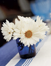
My second design is daisy. I love daisy because of its purity and simple beauty. About this design, my tutor said it was more improved than the previous one. It is simple, but clear. I chose a green grass hill under bright blue sky as the background for my 7 lovely white daisies.

I drew this one faster, about 6 hours. My friends advised that the letter H should be changed a bit because it looked as similar as the letter A. Once again, I fixed it and found out that it was clearer.


That's all about my first designs. Thank my tutor and my classmates very much to provide me a lot of valuable advices to fix them better.